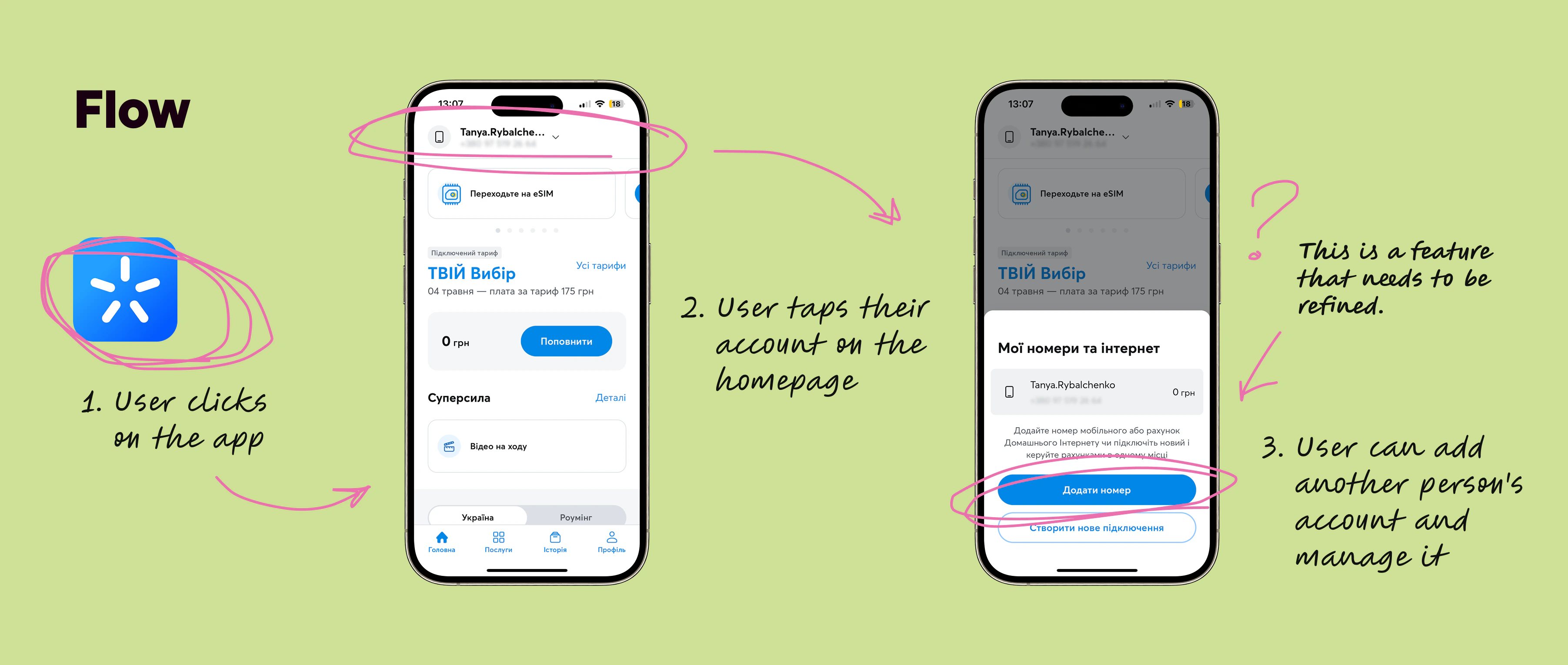
 This is the flow that shows how the feature worked before we started working on it.
- Period
- 2024, 3 months
- Tools
- Figma, Maze, TL;DL
- Industry
- Telecommunications
- Team
- 5 members
- My role
- UX Researcher, Product Designer
 Overview

 Research & Insights

 Hypotheses & Design

 Reflections & Learnings
Kyivstar – Kyivstar – Kyivstar – Kyivstar – Kyivstar –
Kyivstar – Kyivstar – Kyivstar – Kyivstar – Kyivstar –
Improving Family Account Experience to Drive Product Expansion
Overview
This is the flow that shows how the feature worked before we started working on it.

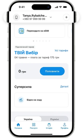
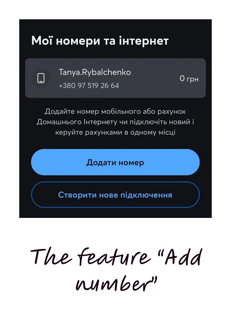 This is a screenshot of the feature we were going to work on.
Research insights
Research insights
For research
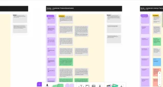
449 notes
2 June 2026 at 16:58
🎯 Goals
Validate the relevance of multi-account usage
Identify usability issues
Find opportunities to increase feature adoption
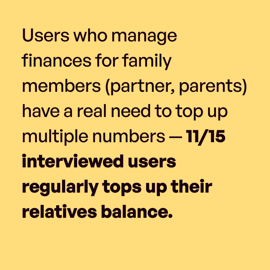
Real need to top up relatives' numbers — 11/15 users do it regularly.
In-depth interviewsThe feature is relevant, but users don't associate it with the app — they solve the need through workarounds (bank account, cash)
In-depth interviewsDiscovery is accidental: one user found the feature while setting up a Kyivstar home internet connection, not through the app itself.
In-depth interviewsThe "Add Number" button is not visible enough — users don't find it on their own.
In-depth interviewsAdding a number has unclear conditions — Vladyslav tried to add a number but couldn't due to some restriction, with no explanation why.
In-depth interviewsOnce a number is added, control is limited — Yevhen couldn't troubleshoot his wife's number through his account, which was his main expectation.
In-depth interviewsThe top-up flow inside the app is too long compared to Mono (a bank app), where the phone number is immediately visible.
In-depth interviewsSMS from Kyivstar already triggers top-up behavior — both Vladyslav and Maryna recharge only after receiving an SMS.
In-depth interviewsThe success screen after a transaction is a high-intent moment — users just managed their account and are open to discovering related features.
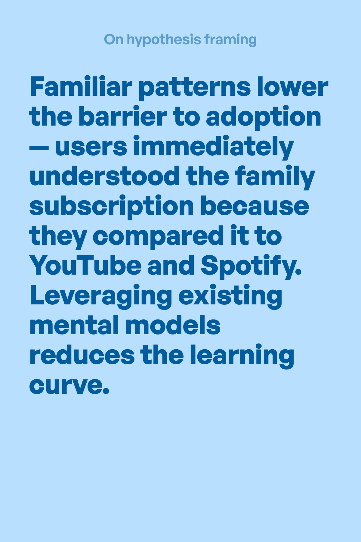
In-depth interviewsFamily subscription framing (like YouTube/Spotify) makes multi-account feel familiar and valuable, lowering the barrier to adoption.
In-depth interviewsHypotheses & Design
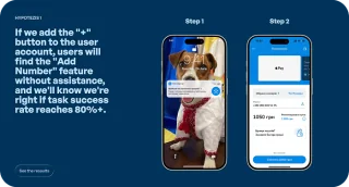
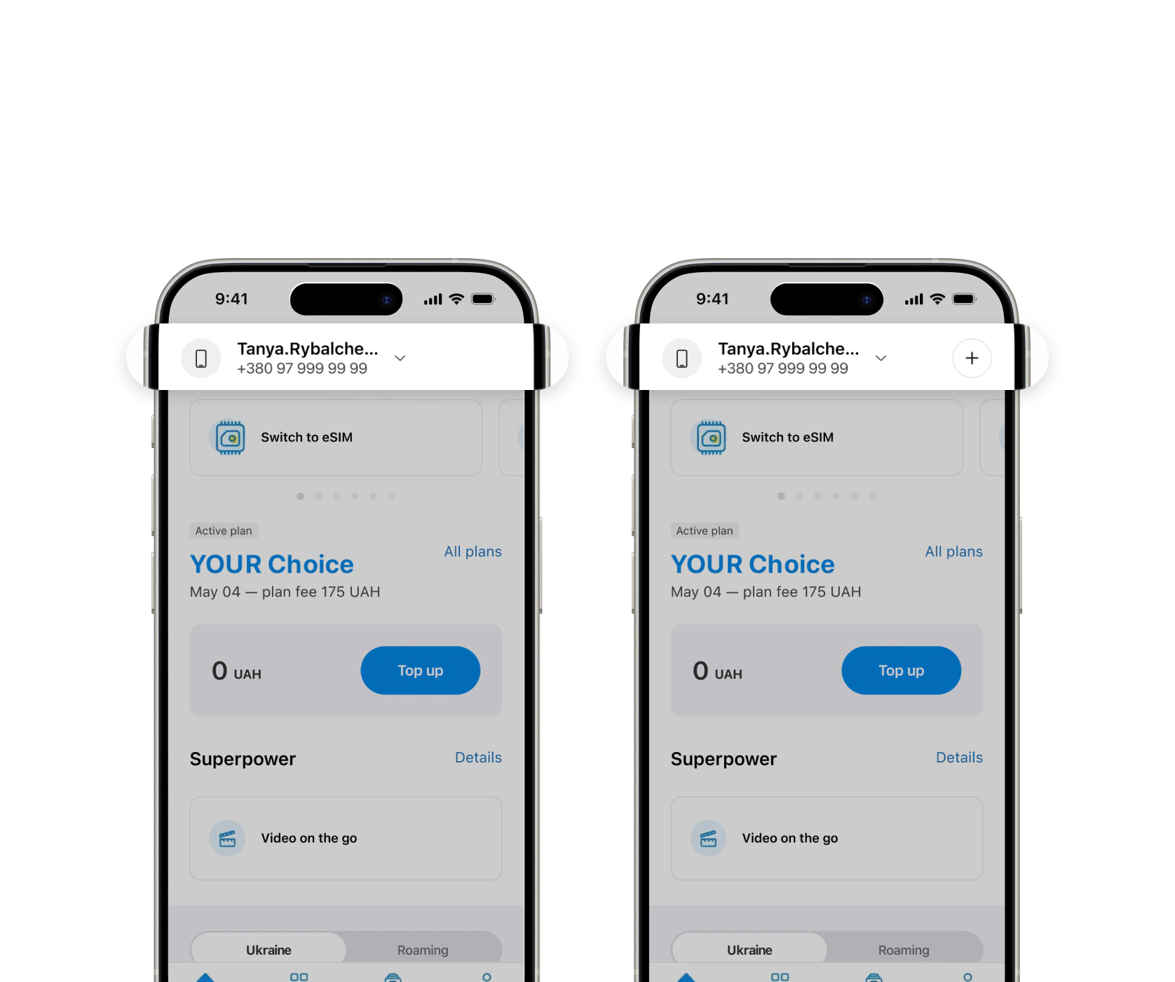
Hypothesis 1
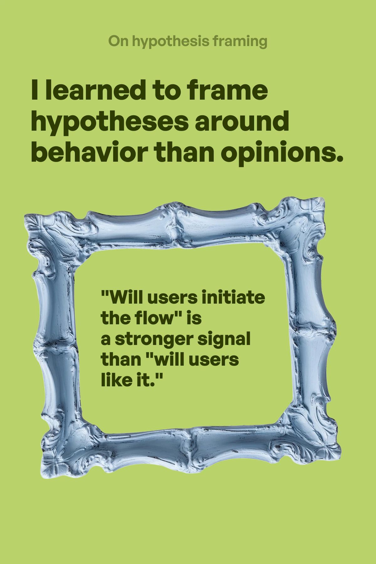
If we add the "+" button to the user account, users will find the "Add Number" feature without assistance, and we'll know we're right if task success rate reaches 80%+.
Testing result
100% users clicked the "+" intuitively without prompting, recognizing it as "add" immediately.
Metrics We'd Track
feature discovery rate
number of added numbers per month
Hypothesis 2
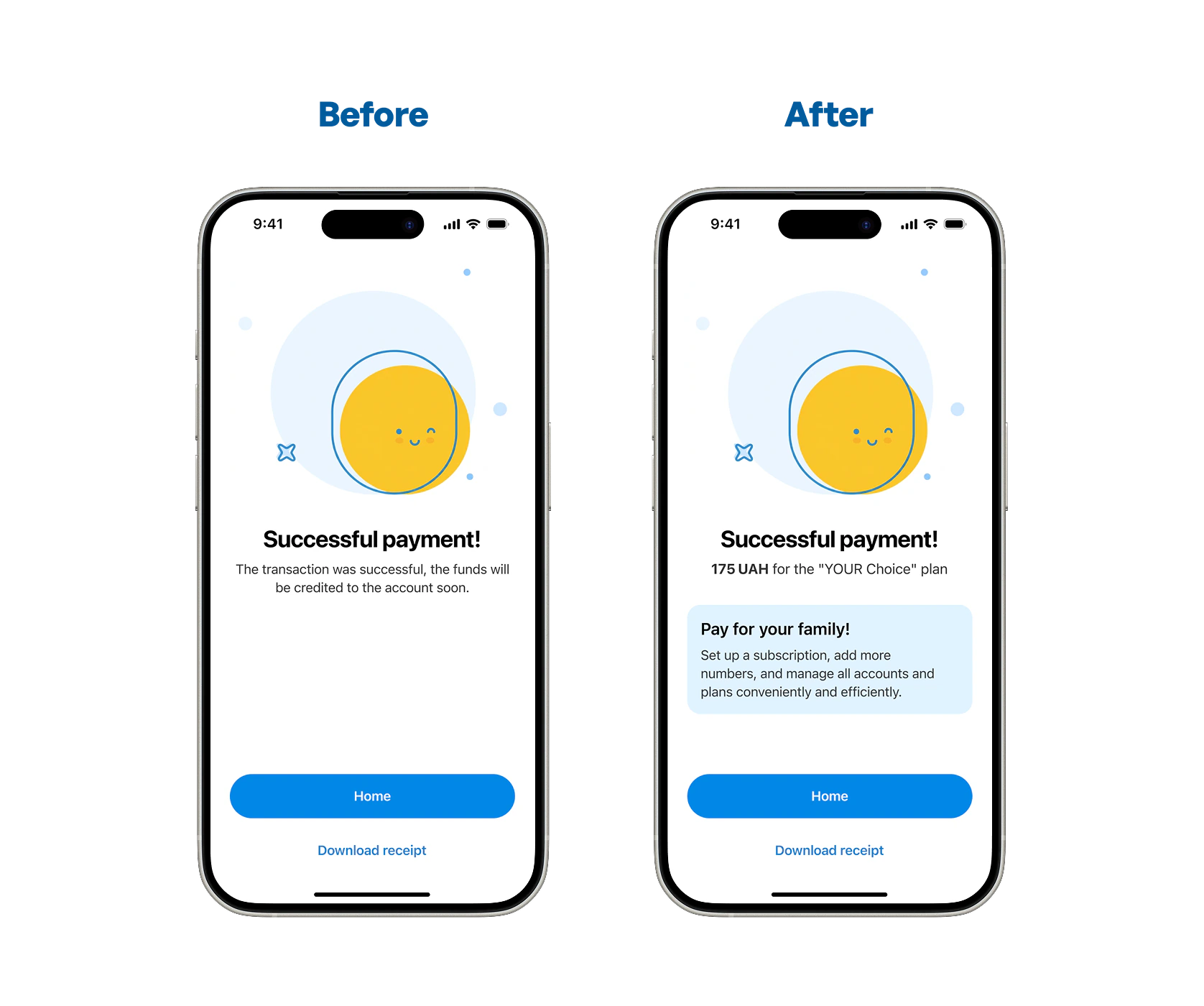
If we add a banner on the success screen after a transaction, users will notice the multi-account feature at a high-intent moment, and we'll know we're right if users click on the banner.
Testing result
80% of users completed the flow via the banner.
Metrics We'd Track
banner CTR
number of added numbers after banner interaction
Hypothesis 3
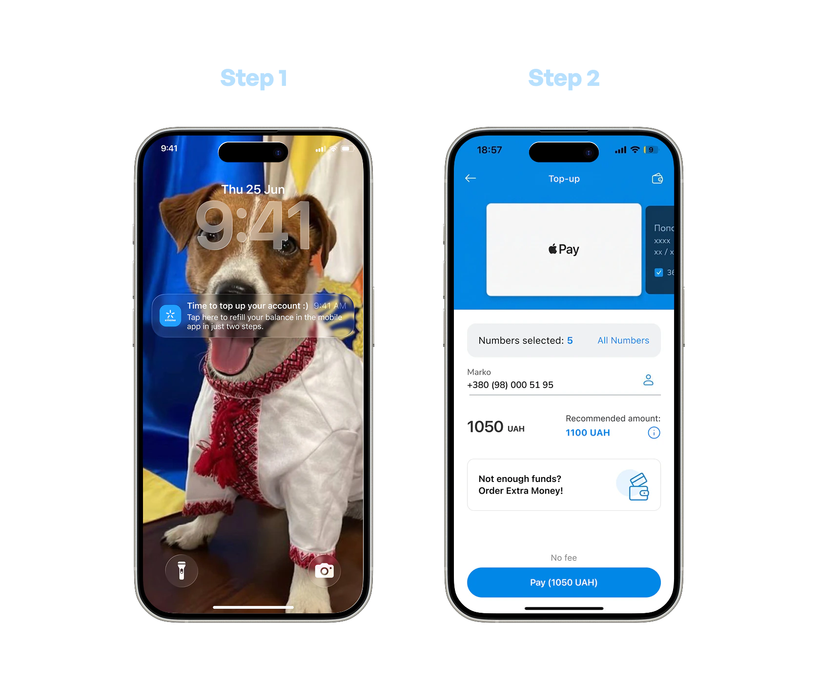
If we add a push notification with a direct link to top up, users will complete the top-up inside the app instead of third-party apps, and we'll know we're right if users complete the flow in 2 clicks without confusion.
Testing result
Users completed the top-up in 2 clicks without confusion or drop-off.
Metrics We'd Track
push notification CTR
in-app top-up conversion rate
drop-off rate per step


Hypothesis 4
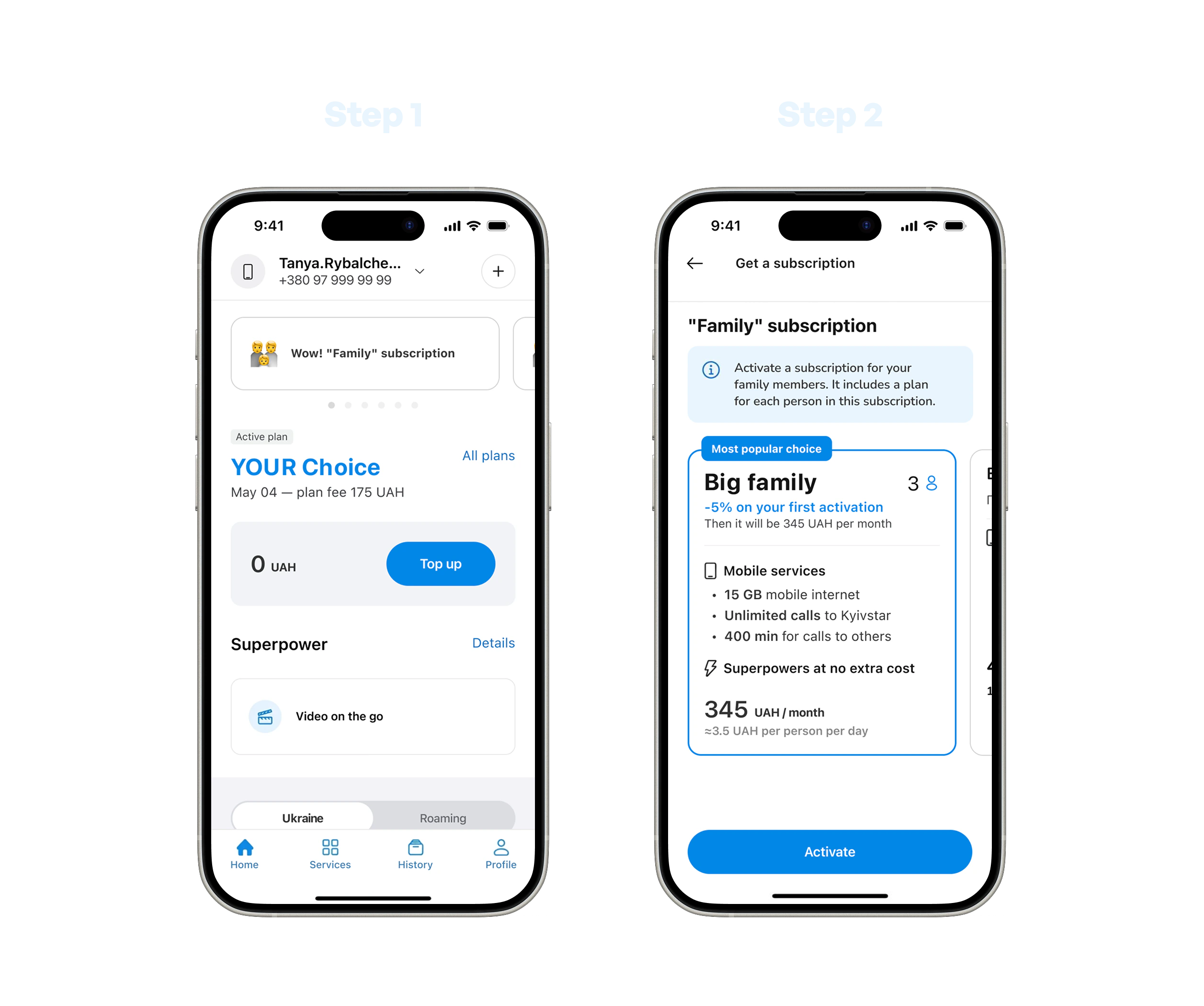
If we add a family subscription, users will consider adding family members, and we'll know we're right if time-to-complete the "Add Number" task decreases.
Testing result
Users completed the task in 5–7 seconds with a single click, compared to 30 sec–2 min in the previous test with misclicks (~90% faster).
Metrics We'd Track
Family plan activation
Numbers added per account
Family plan churn


Reflections & Learnings


Nice to see you here!
Let's connect via...
...and talk about your product, ideas, or just have a virtual coffee together!
LinkedIn Instagram Dribbble [email protected]